A new logo adopted by the City of Vancouver has been mocked relentlessly this past week for being ‘bland’ and ‘uninspiring’. Was this a missed opportunity for the City Of Vancouver to create a brand identity that would help cement its place in the world as an up-and-coming major city?
A strong brand identity is absolutely necessary if you are competing with other regions worldwide for attention in tourism and business. Great city branding needs to be ‘owned’ by the city, the brand has to resonate and be understood by residents of all ages and backgrounds, as well as its companies and organisations. Branding isn’t a quick fix to mask a city’s problems, the visual identity needs to act as a representation of the personality that is already there. Creating a brand identity for a destination is not just about the logo design, but about the intricate details that lie deep within the roots of the city and exploring ways to communicate these roots visually. To achieve great success with any branding project and to reduce the risk of failure, takes a lot of time, research, development, strategy and of course applying talented and skilled design to the results.
This led us to think about the cities that have inspired us by truly expressing their essential features and values through their logos and visual identities. Below, in no particular order, are our top five.
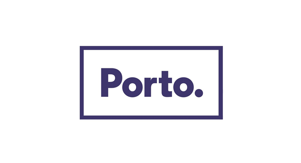
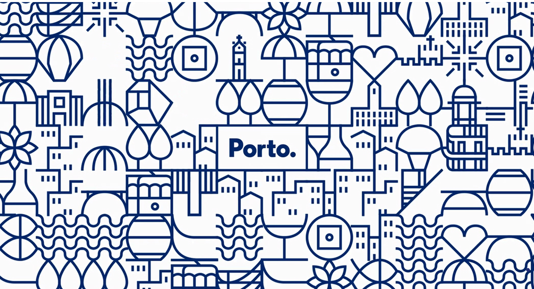
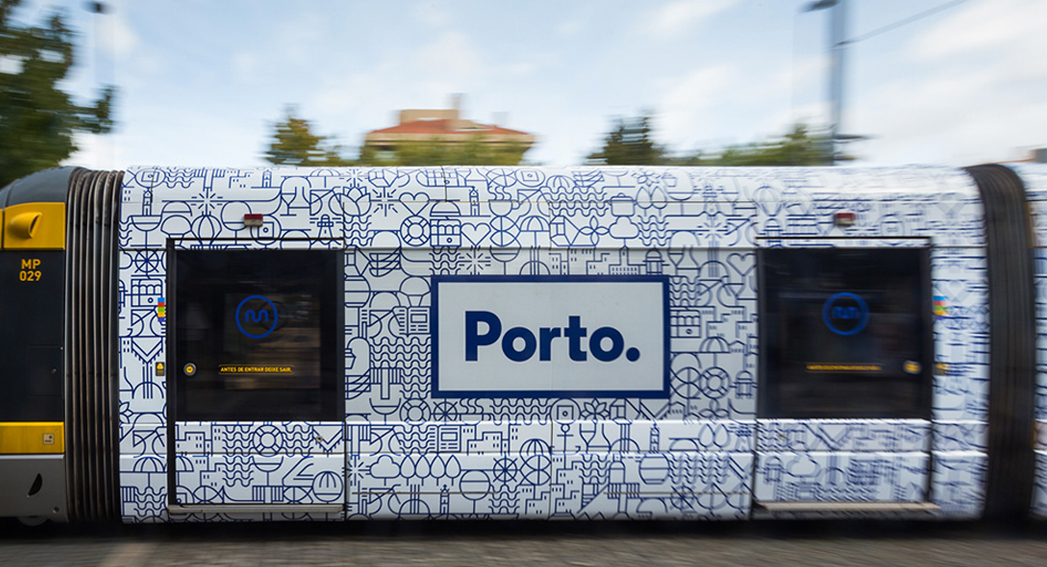
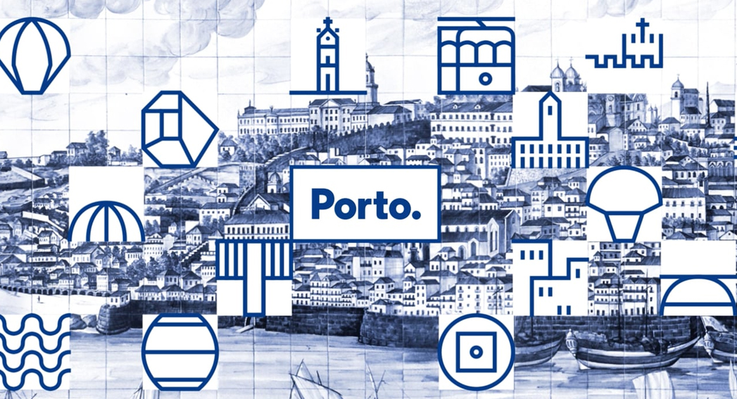
1. PORTO
One of our favourites, the Porto identity is motivated by the extensive supply of blue tile around the city. The identity is built around an organisation of Porto-specific graphics that can be joined in endless ways, both in terms of icon amalgamation and pattern arrangement. The resulting designs are very attractive and generate beautiful textures in ads around the city.
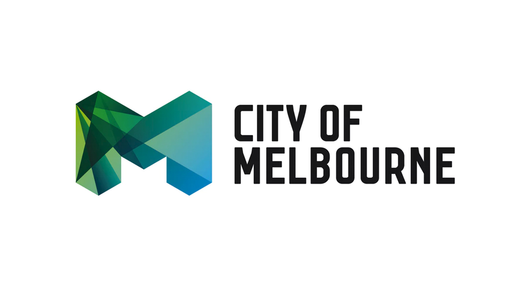
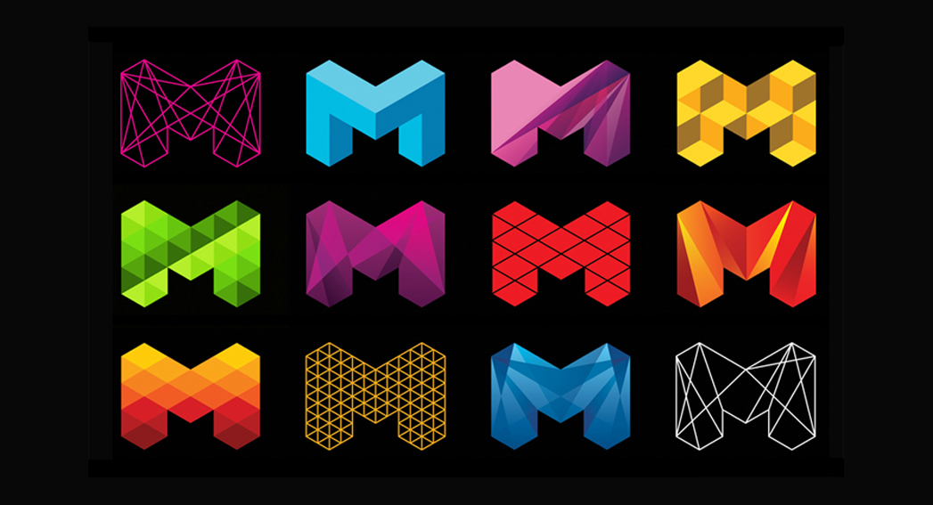
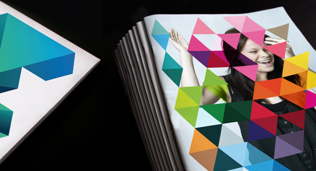
2. MELBOURNE
This trendy and progressive logo and identity system reflects a very dynamic, vibrant and cool city, just as how we would imagine the city of Melbourne to be. The identity shows its strength and versatility at its best when it has been adapted in form and colour on different city campaigns marketing materials.
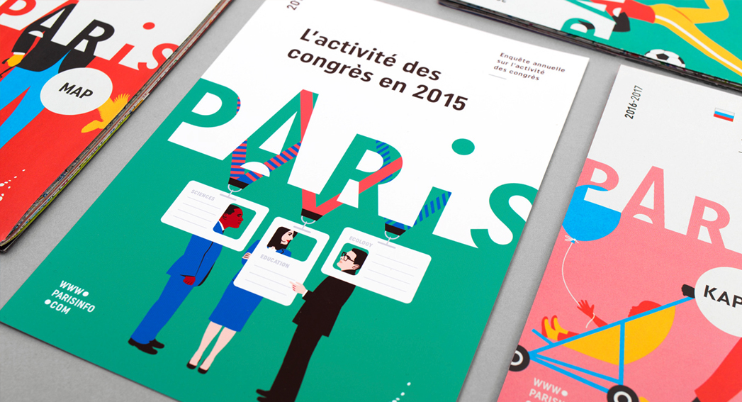
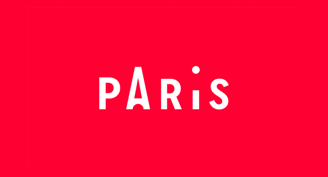
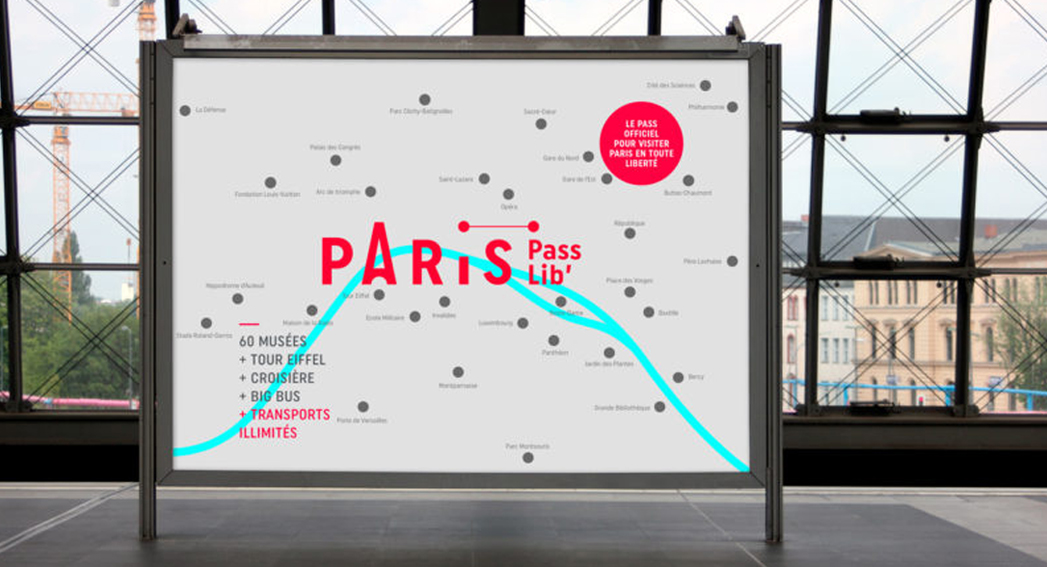
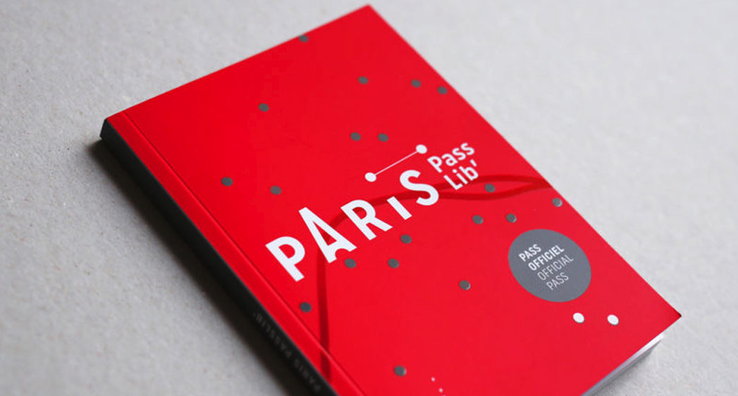
3. PARIS
A fantastic wordmark, that nods to their iconic landmark without being too literal. The beauty of this wordmark comes to life on the printed and online communications where it has been effectively affixed to larger spaces and lively, colourful illustrations
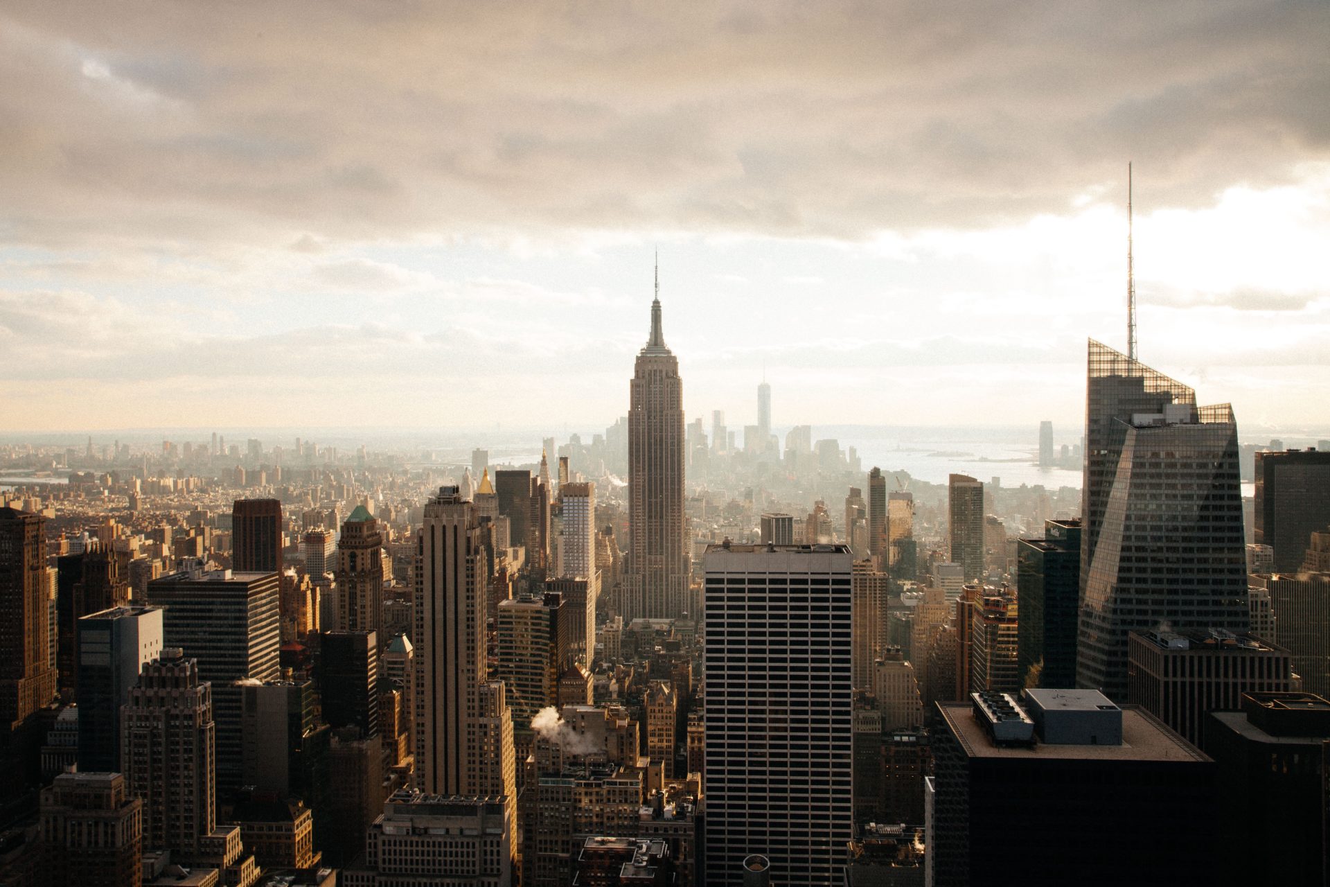
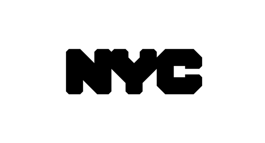
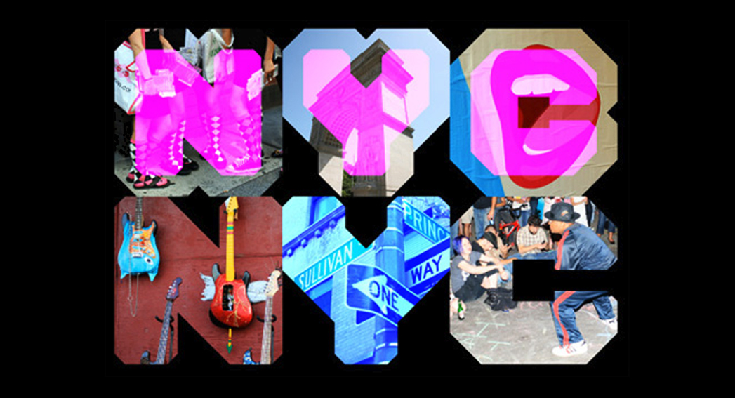
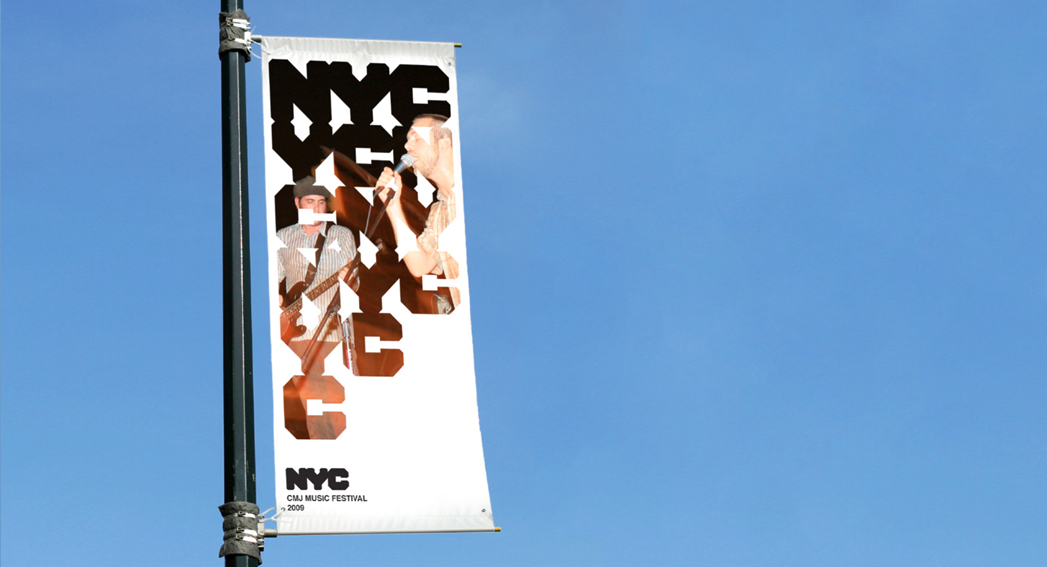
4. NYC
This system encompasses everything that is New York City. The identity is loud, bold, vibrant and energetic. The kaleidoscopic quality reflects the different ways of life brought together in this multicultural city.
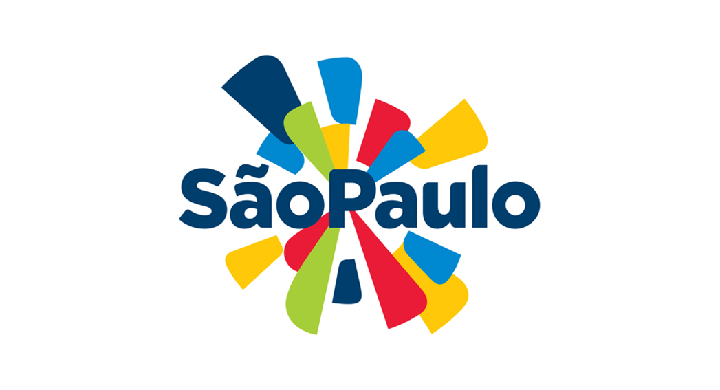
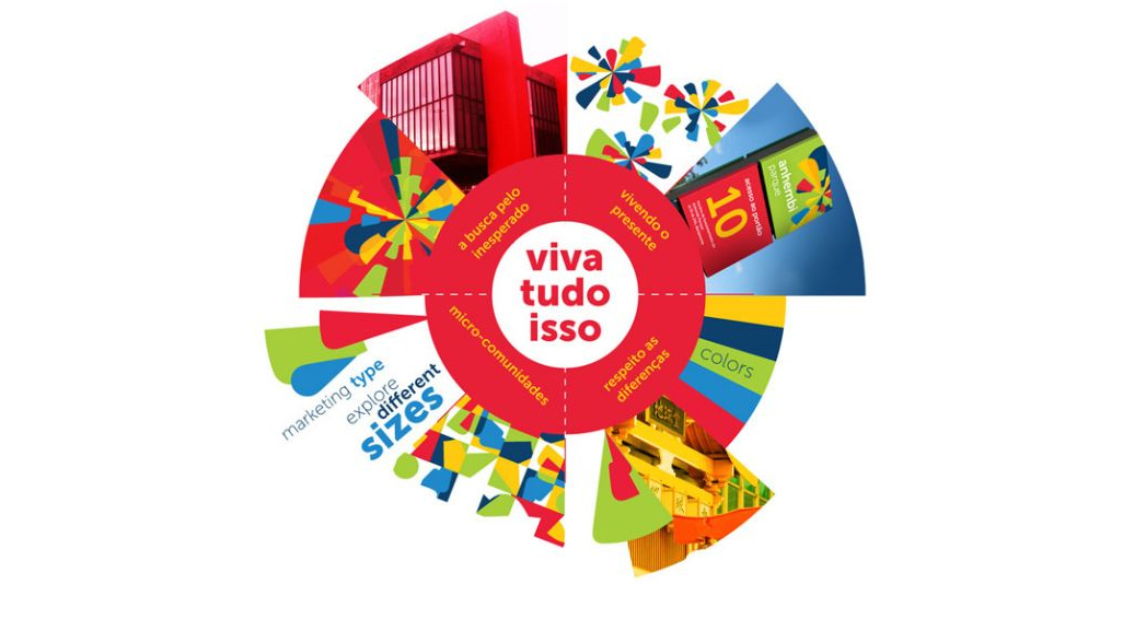
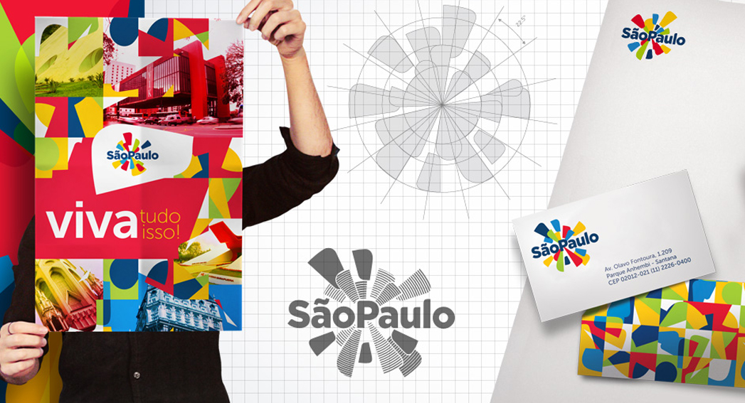
5. SAO PAOLO
We can’t see many cities getting away with this bold, festive logo design and colour palette. Encapsulating the city’s spirit through colour and exploding shapes creates a strong brand image and emotional response. A risky design executed well.