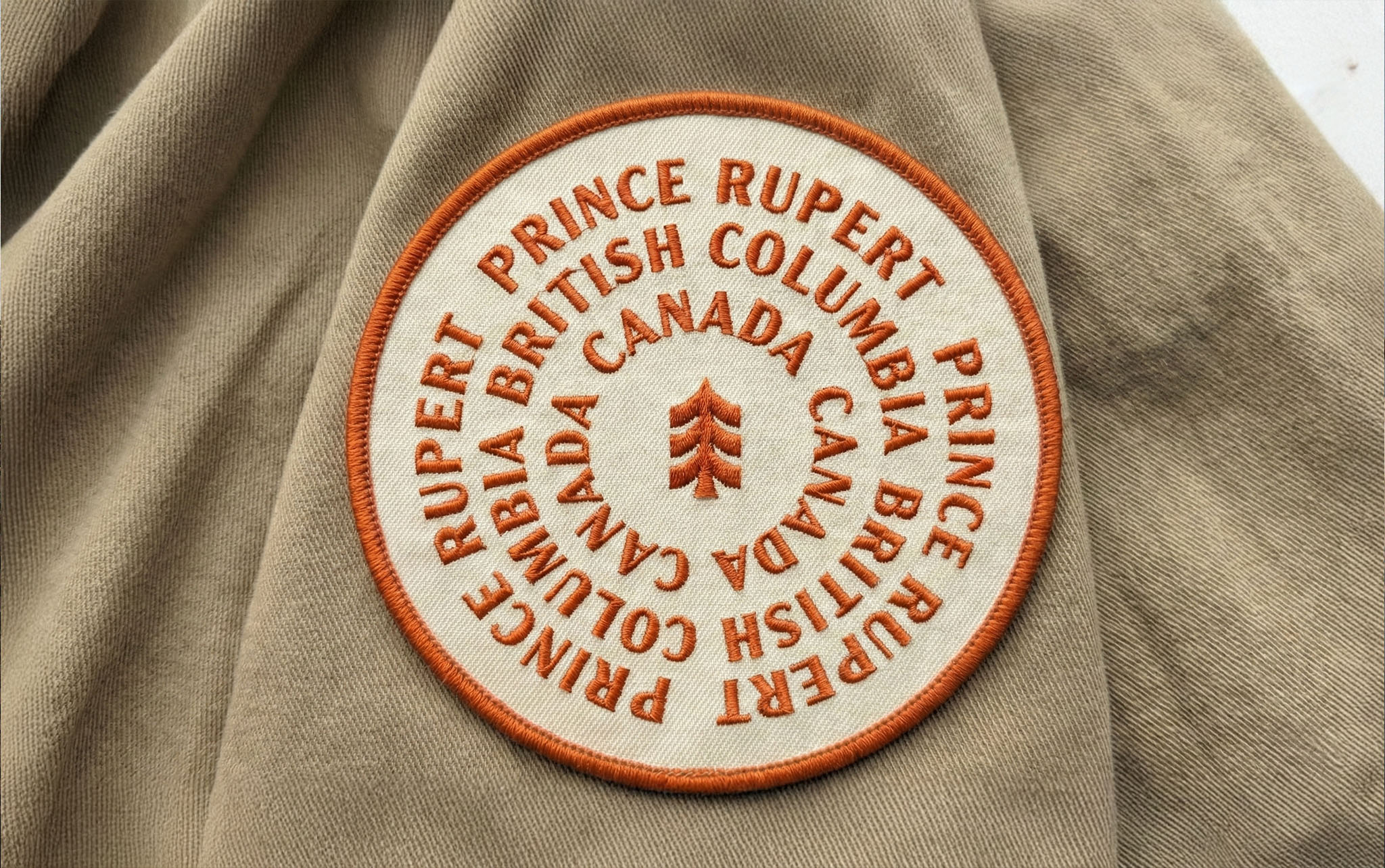
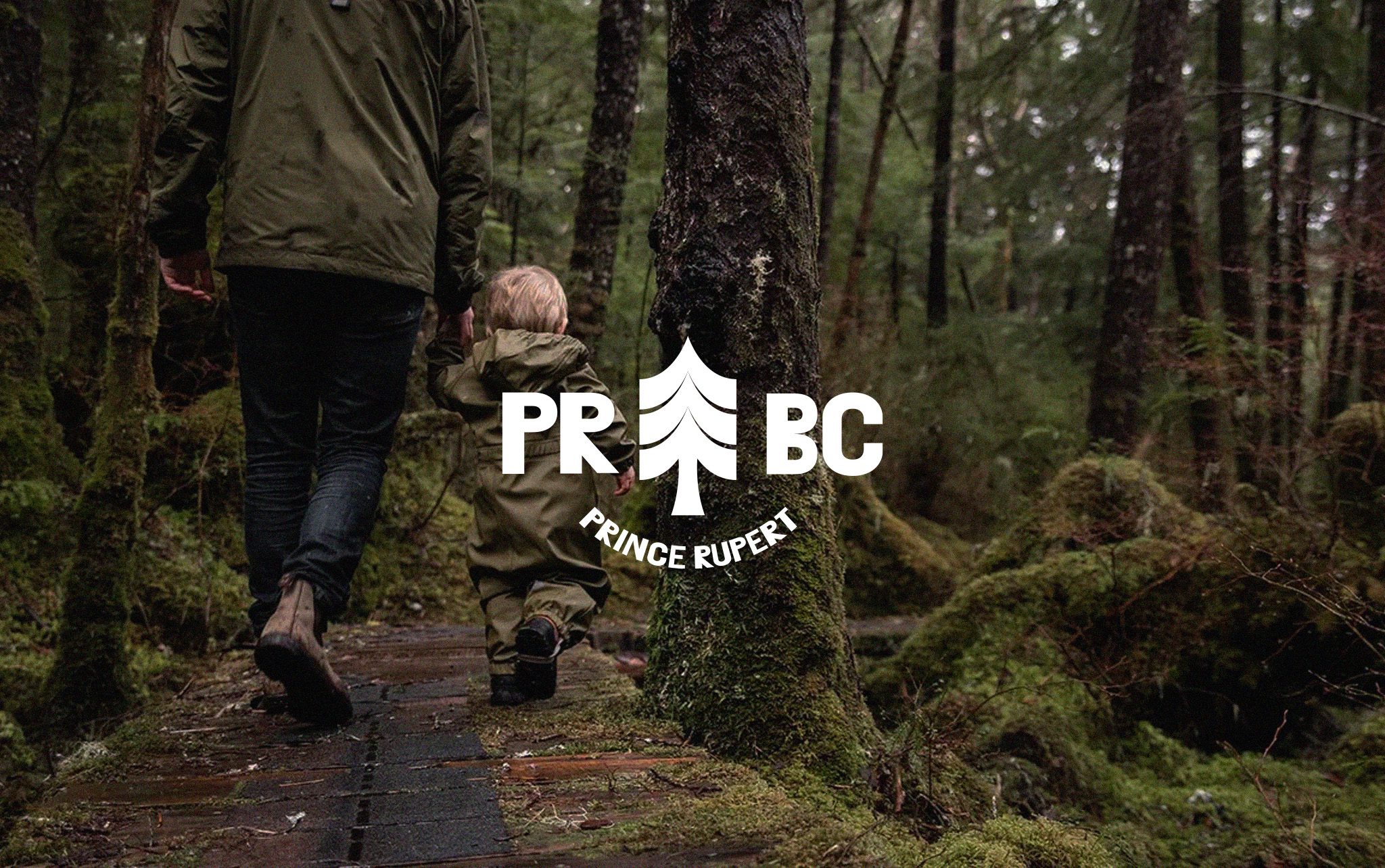
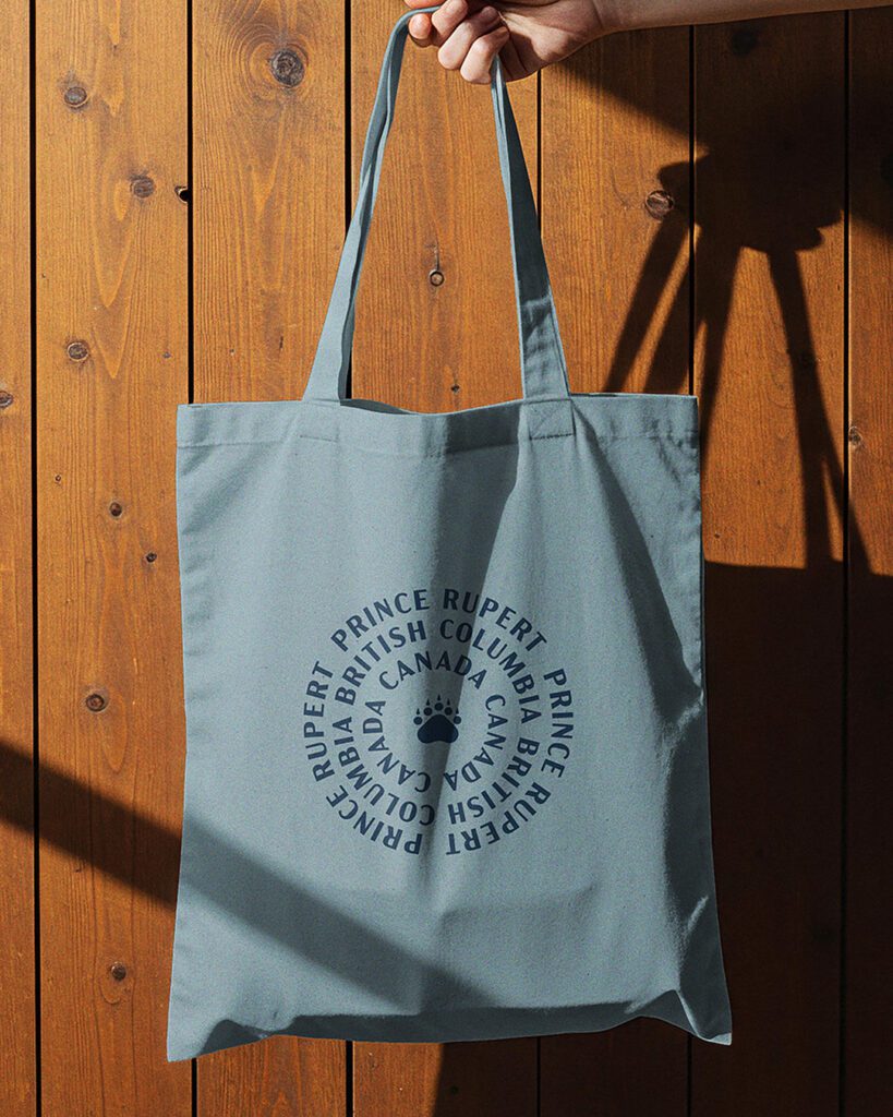
Our strategy was to embrace Prince Rupert’s “out of the ordinary” spirit, a destination where the wild North Coast meets working waterfronts, and every corner tells a story of resilience, creativity, and quirkiness. This ethos is carried through in the brand’s typography, color palette, and design elements, which draw inspiration from the fishing industry, the waterfront, and the character of its people. Bold, industrial textures meet organic shapes and vibrant accents, creating a visual identity that feels authentic, lively, and unmistakably rooted in Prince Rupert’s unique community and environment.