A new vibrant hub that weaves together the essence of craft beer with the tapestry of community connections.  You're not just entering a place to enjoy exceptional brews – you're immersing yourself in an experience that resonates with the spirit of Poco.

The challenge

In a sea of breweries that have sprouted across Metro Vancouver, we understand the need to transcend the ordinary and create a brand identity that not only stands out but resonates with a deeper, timeless significance.

Our insight

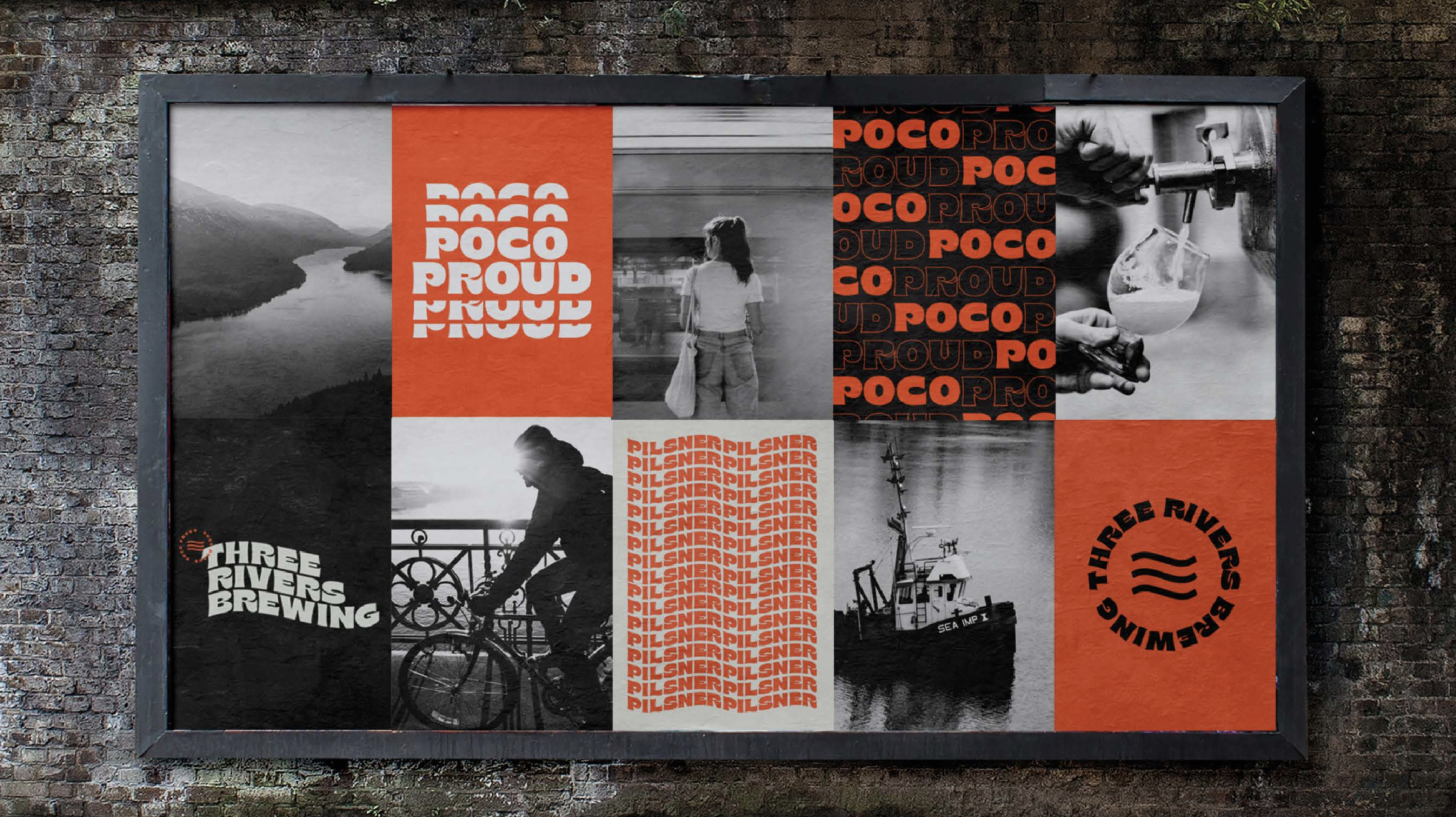
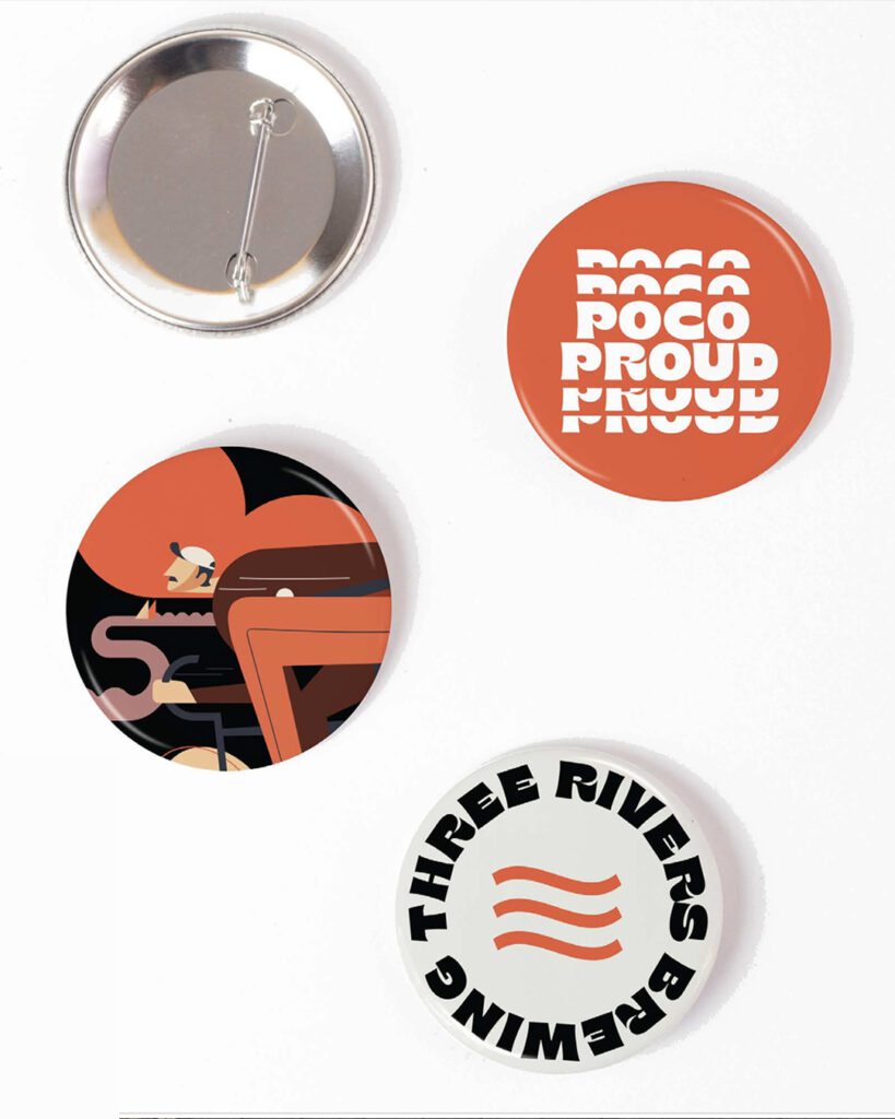
During our discovery with the brewery's founders, we uncovered a unique and powerful perspective that's deeply connected to the location. As we delved deeper, we saw a fascinating link between Poco's three rivers – they're like the veins that connect and energize the community. And this connection goes even further, blending seamlessly with the rhythm of transportation that pulses through the town.
The brewery is located near the riverbanks, embraced by a network of bike paths, and easily reachable for both commuters and bus riders. This location embodies this wonderful blend of elements. It's like a meeting point in between. This  inspired us to come up with a name that captures the  spirit of the community in one name.

Our answer

Alongside the bold logo, we've designed a collection of captivating transport-themed illustrations that work harmoniously to both complement and elevate the essence of the brand identity.
These illustrations serve as vibrant visual narratives, seamlessly weaving elements of transportation into the fabric of the brand story. Each image is crafted to evoke a sense of movement, energy, and connectivity – mirroring the dynamic spirit of our brewery's location near the bustling riverside and transportation arteries.