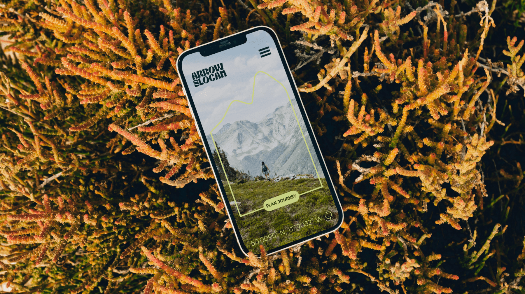
We positioned Arrow Slocan as more than a destination—it’s an invitation to shift your perspective. Our brand messaging centred on the idea that “a change of scene can inspire a change of direction.” Through evocative language, we painted a picture of the region as a sanctuary for the soul—where the distractions of modern life fall away and the big picture comes back into focus.
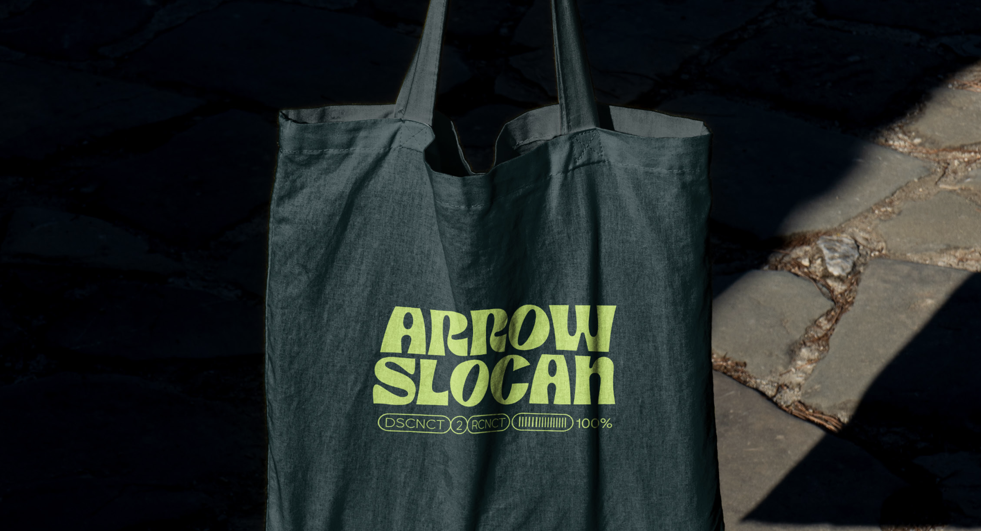
The visual identity leans into themes of clarity, solitude, and reconnection. Messaging reminded visitors that time is ours to reclaim, and Arrow Slocan is where we can choose to spend it wisely - on ourselves, not necessarily by ourselves.
By highlighting the intentional remoteness and soulful calm of the region, we turned what was once seen as a lack of awareness into a badge of honour. Arrow Slocan became a well-kept secret worth discovering - a place for those ready to reassess, recharge, and rediscover their direction.