A local range of cold brew coffees that are elevating the product in the market by bringing a higher quality drink through improved small-batch but scalable brewing processes.

The challenge

Our goal was to develop a novel name for the cold brew product that perfectly embodies the playful spirit of Vancouver. Simultaneously, we set out to create a visually captivating representation that resonates with the chosen name, ensuring it not only distinguishes itself amidst local competitors but also ignites a sense of inspiration in those who encounter it. 

Our insight

The Floatplane brand is inspired by how a grab-and-go cold brew can support and enhance life’s experiences. From the early morning commute to taking your kid to the bike park, Floatplane takes you there. Defying today’s minimalist trends in the coffee scene, we’ve created a fun and energetic Floatplane world of authentic and spirited illustrations that are taking their cold brew through all life’s best experiences. These eye-catching and inclusive illustrations can be layered together to represent the fun-loving world all at once as a pattern or separated to play specific roles across communications materials.

The result

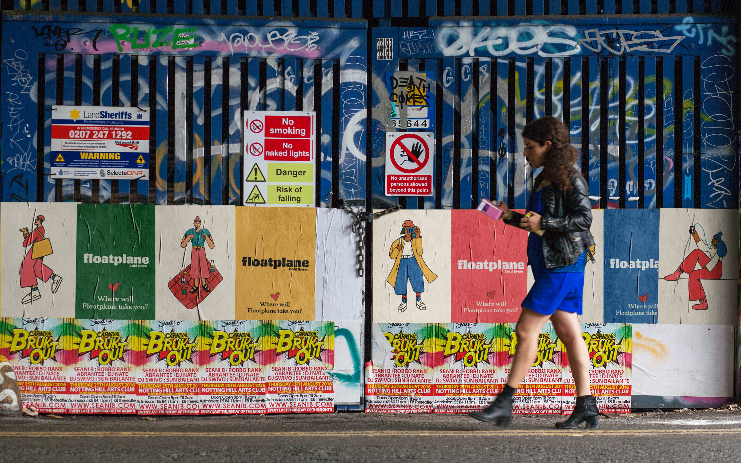
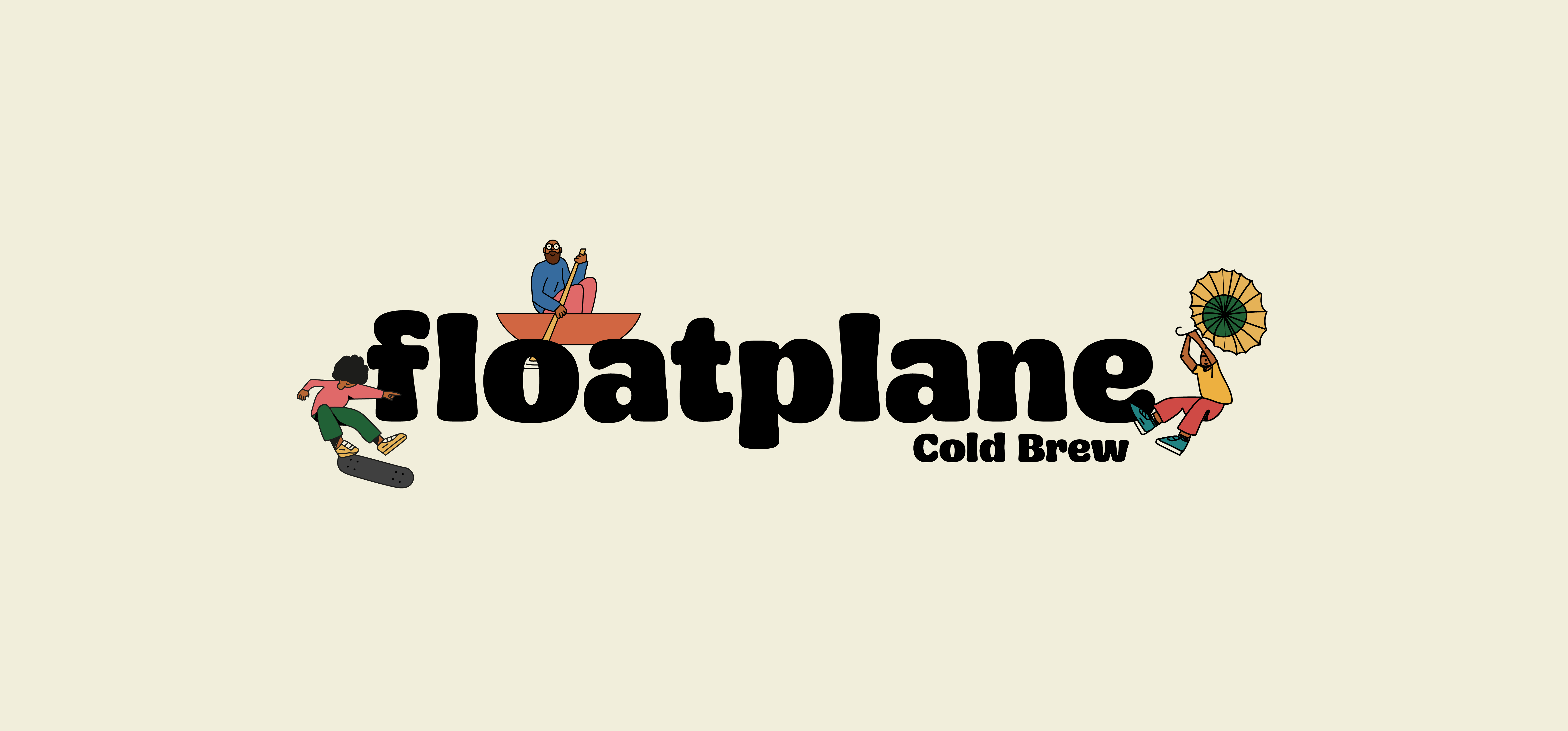
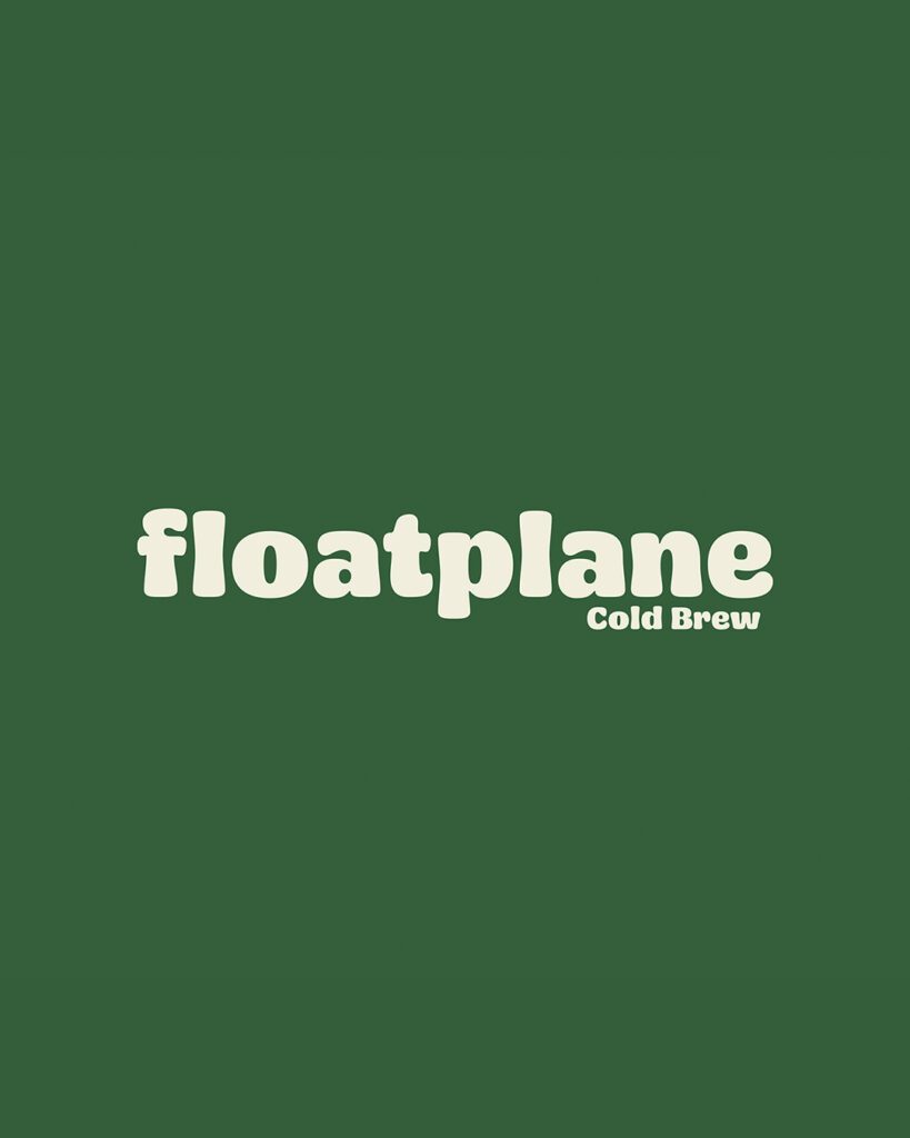
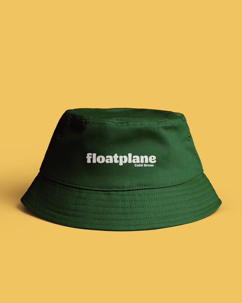
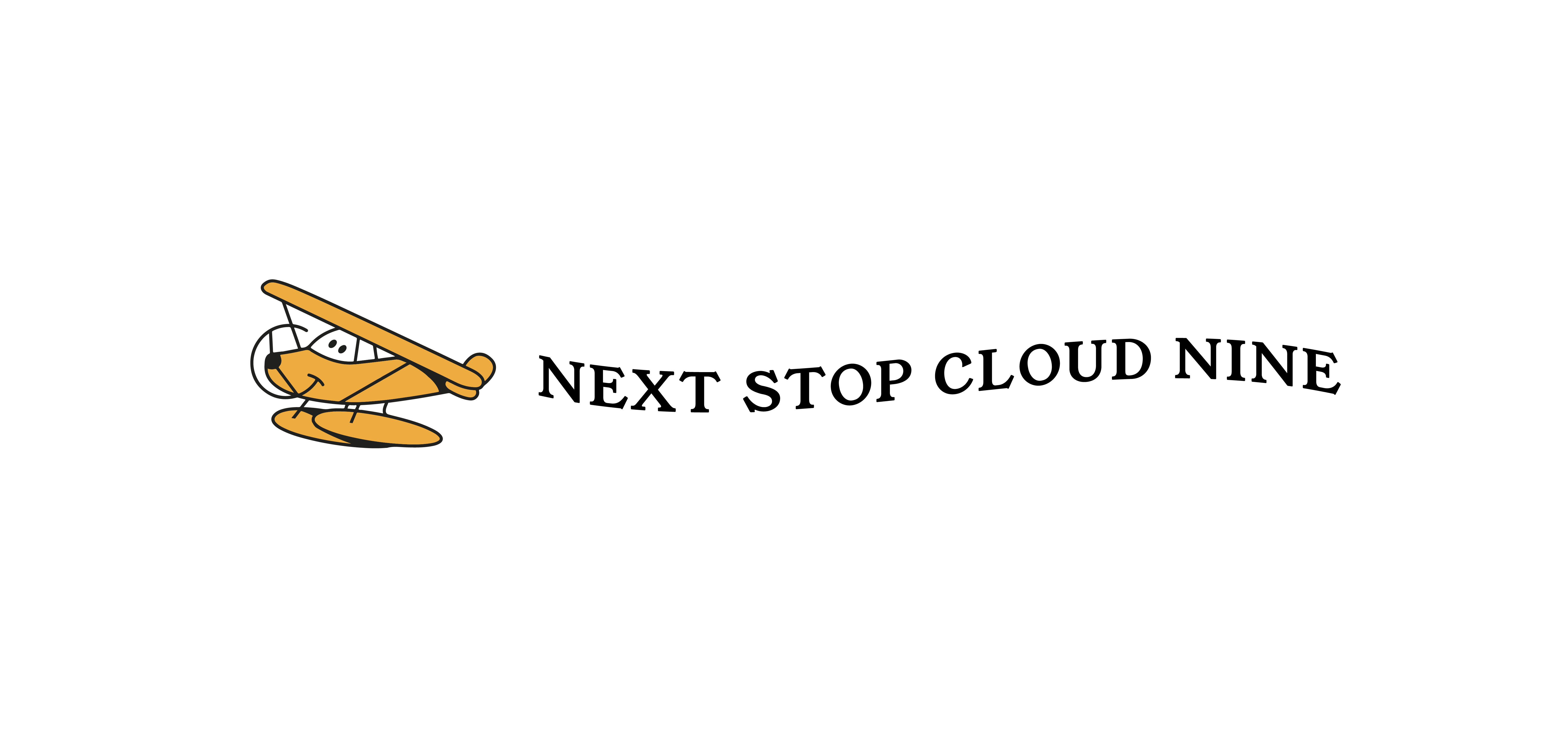
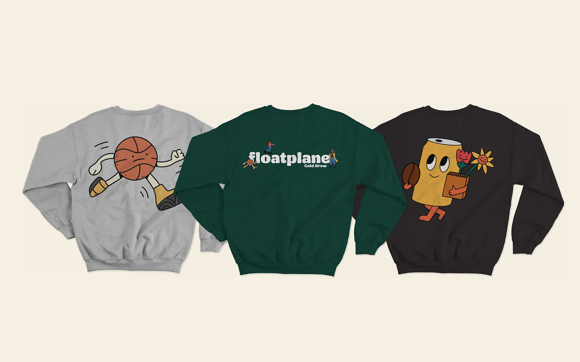
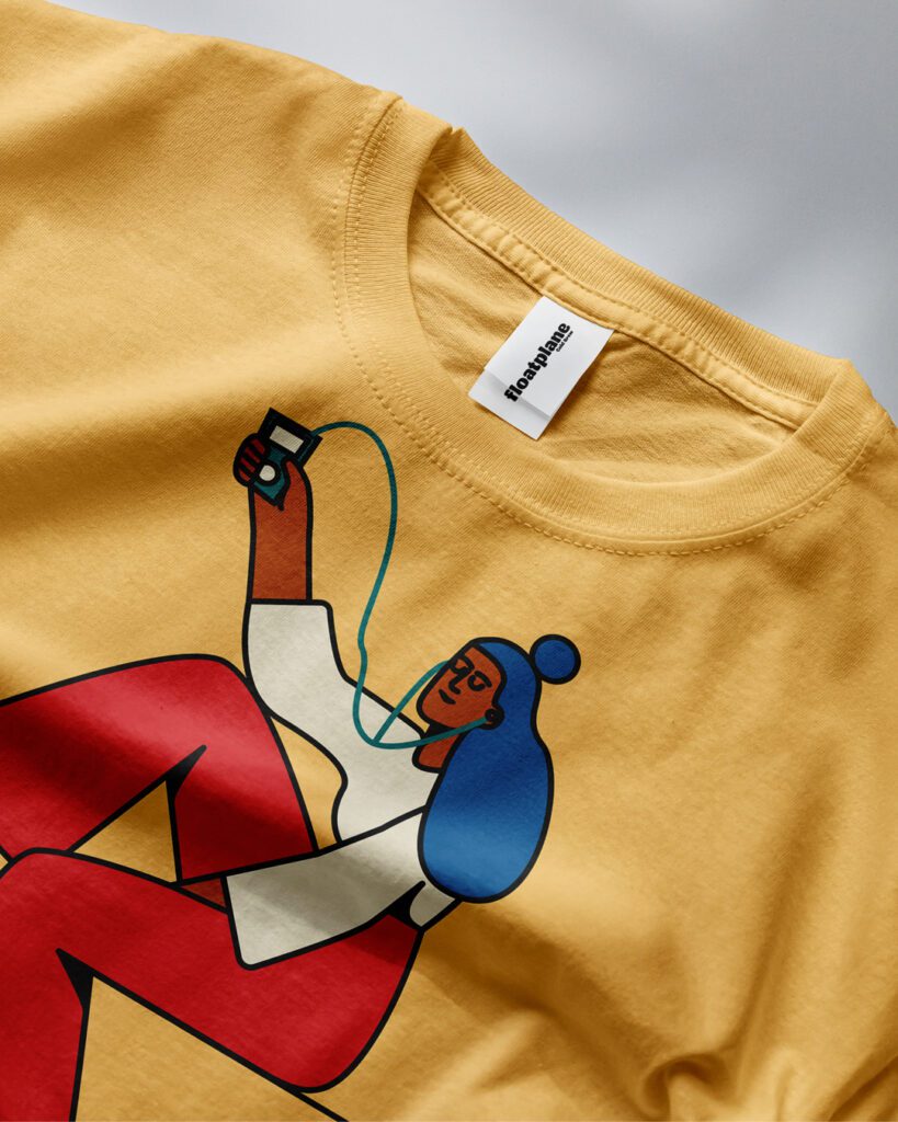
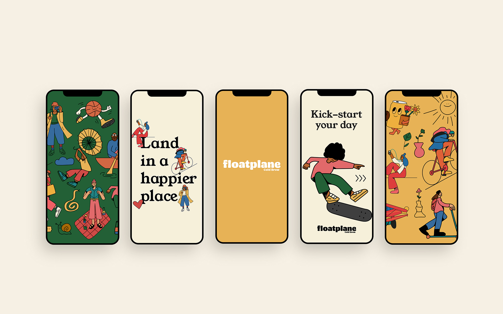
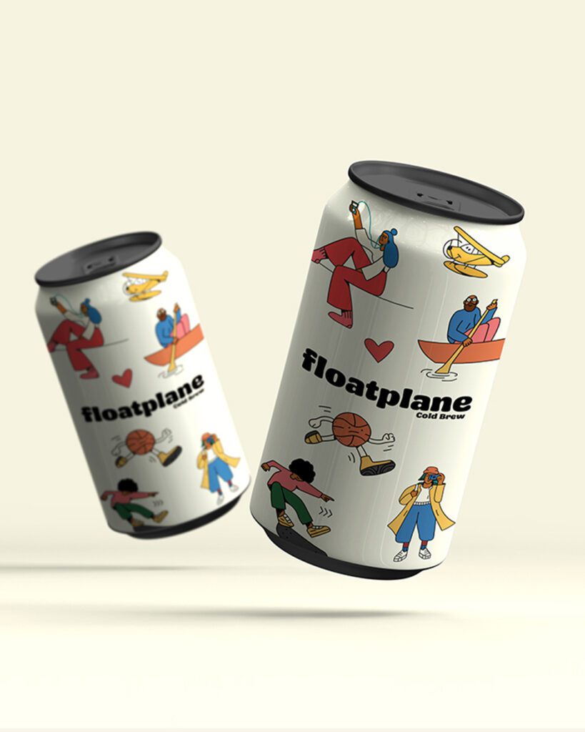
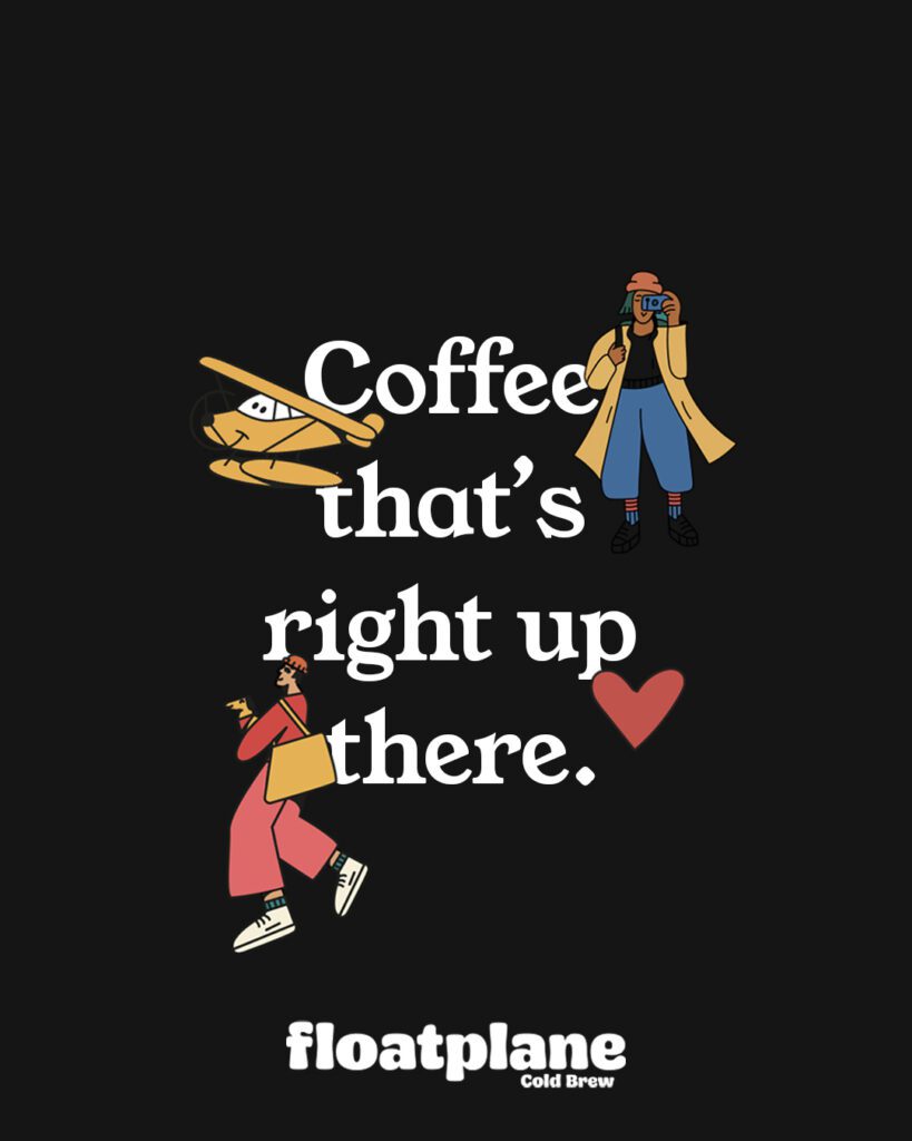
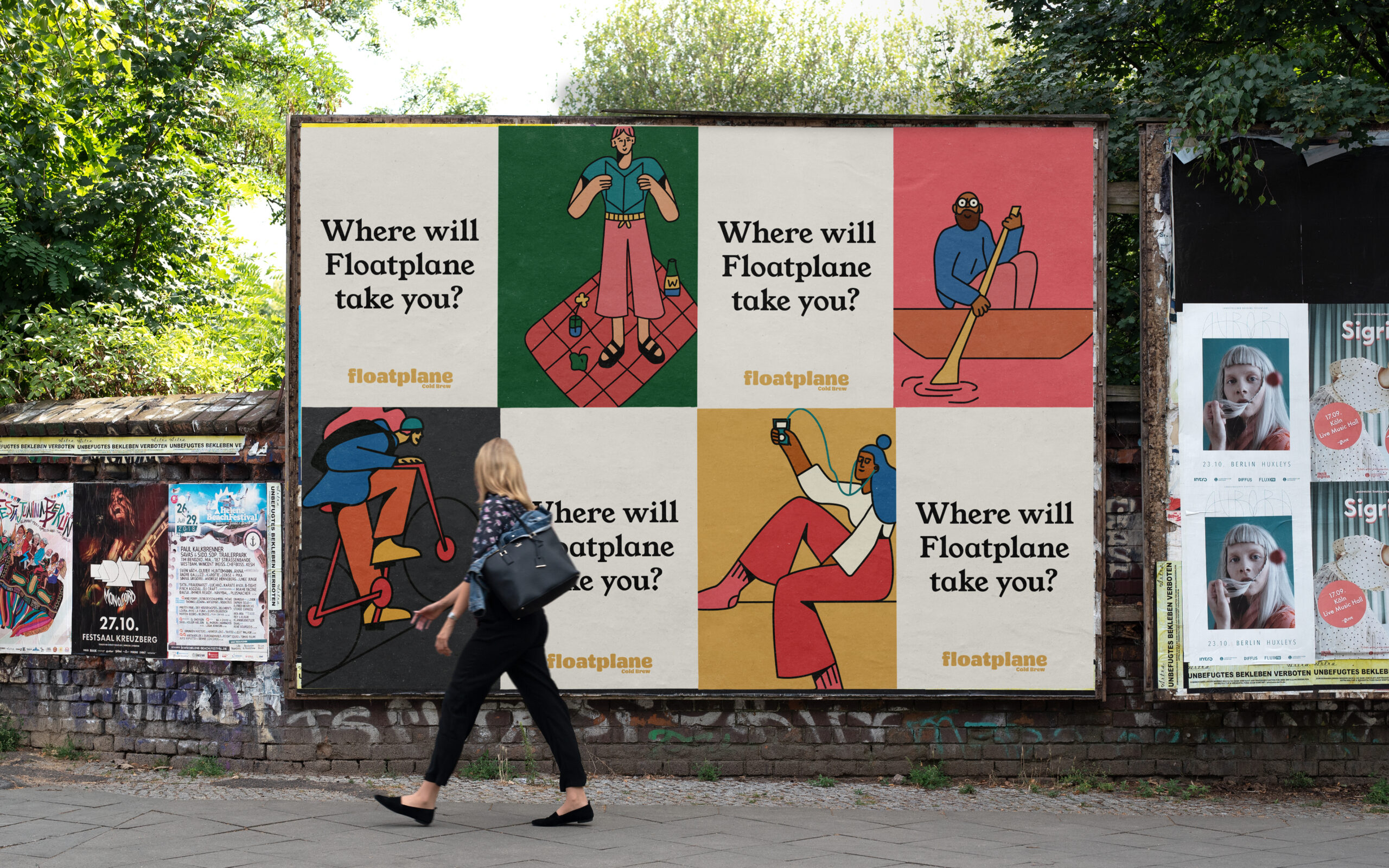
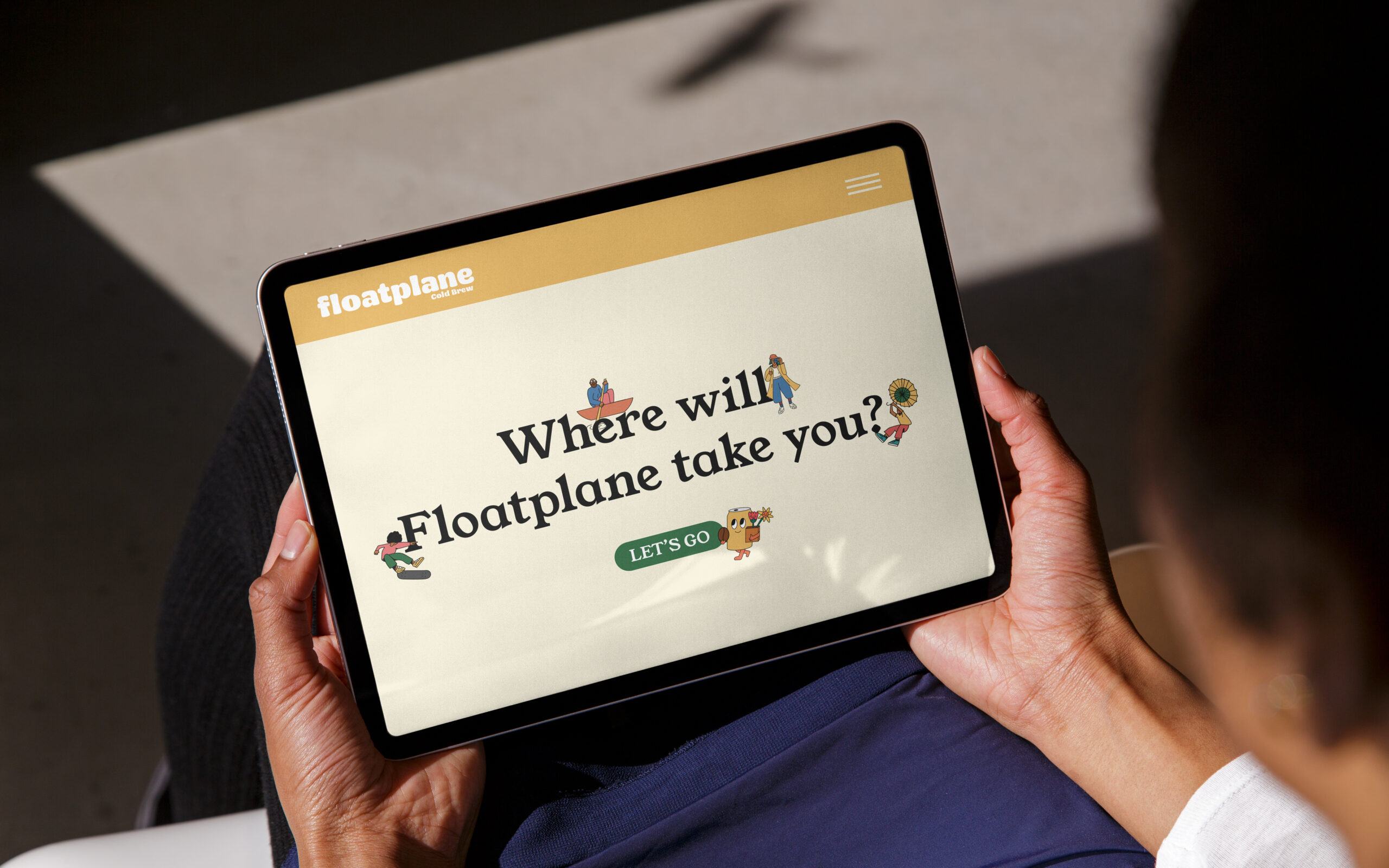
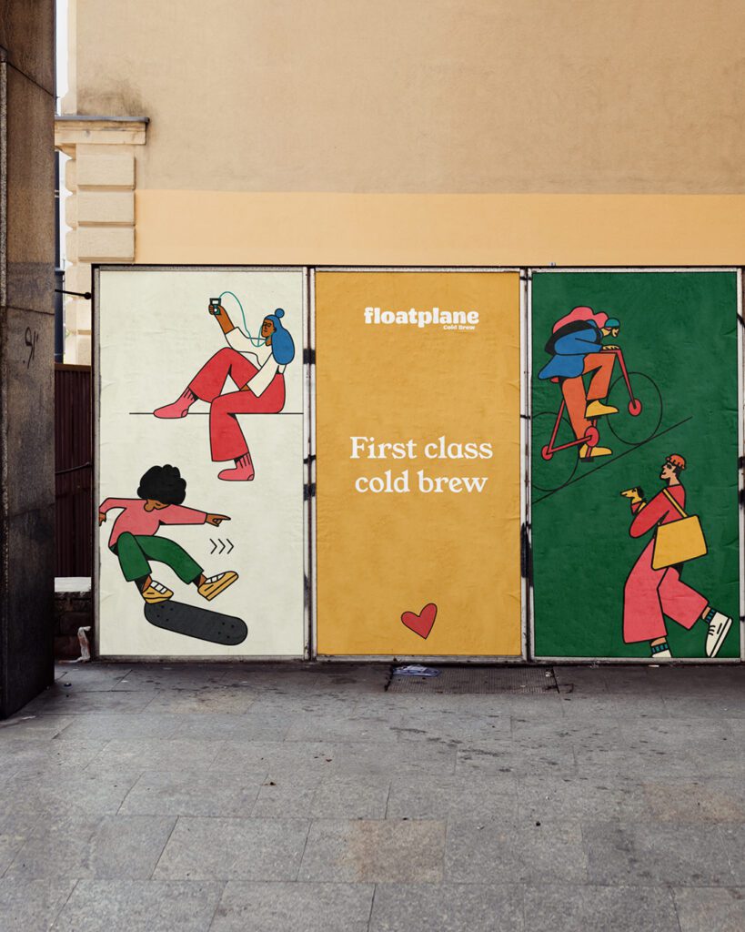
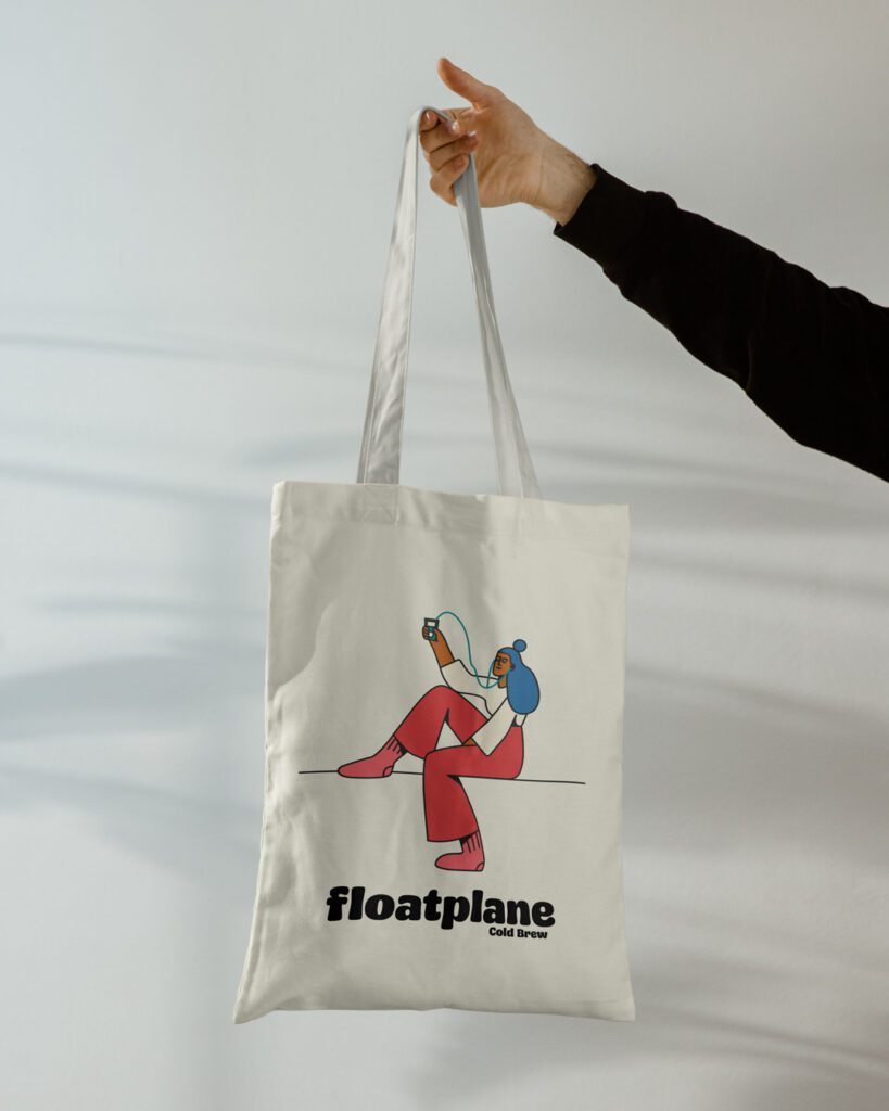
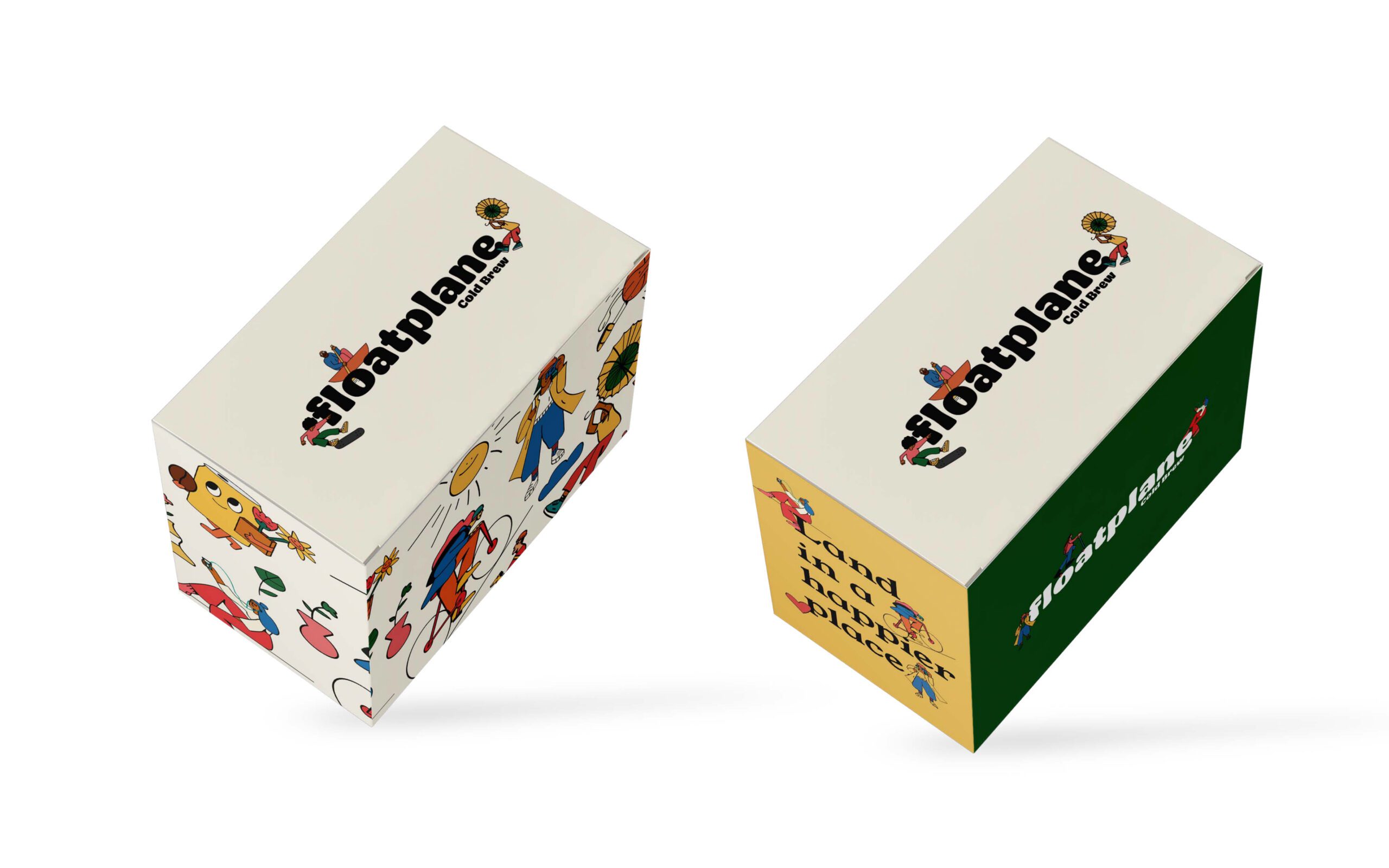
A lively and dynamic logotype, reminiscent of the float pontoons that exude a sense of playfulness, can harmoniously fuse with energetic illustrations. These elements possess the ability to encapsulate the spirit of a joyful world, either as a unified whole or as distinct components, each serving a specific purpose across various communication materials.