Hiy̓ám̓ Housing is the not-for-profit organization mandated to lead the development of non-profit affordable housing for the Squamish People. They are mandated to deliver 1,000 new homes for the Squamish People and contribute to the Squamish Nation’s goal of housing every Squamish within a generation. 

Challenge

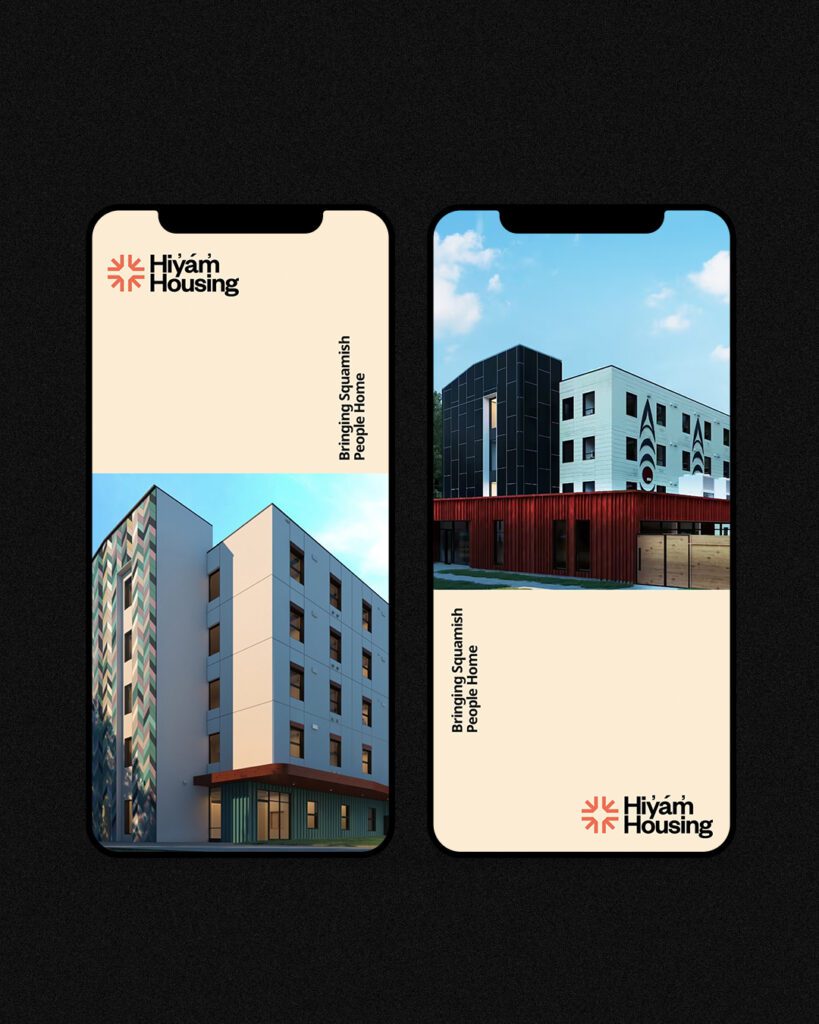
Hiyam Housing is a newly formed nonprofit organization dedicated to leading the development and management of affordable housing projects for the Squamish Nation. Their primary mission is to create and administer cost-effective housing initiatives that cater to the needs of Squamish Nation members.

A key focus for Hiyam Housing is establishing effective communication channels and promoting transparent information sharing. They strive to ensure that tenants, members, partners, and the broader public are well-informed about their housing plans and operational procedures. With a commitment to professionalism and openness, Hiy̓ám̓ Housing aims to foster trust and engagement in all their interactions.

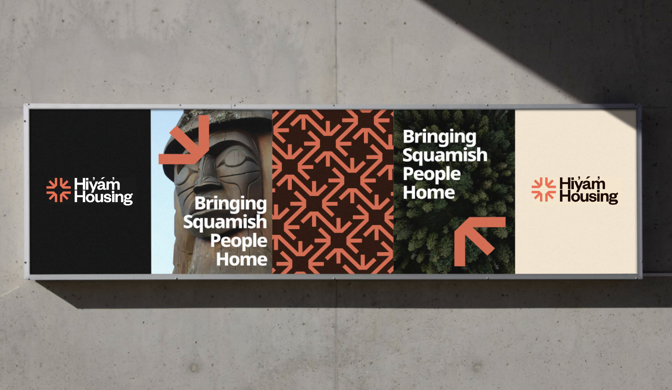
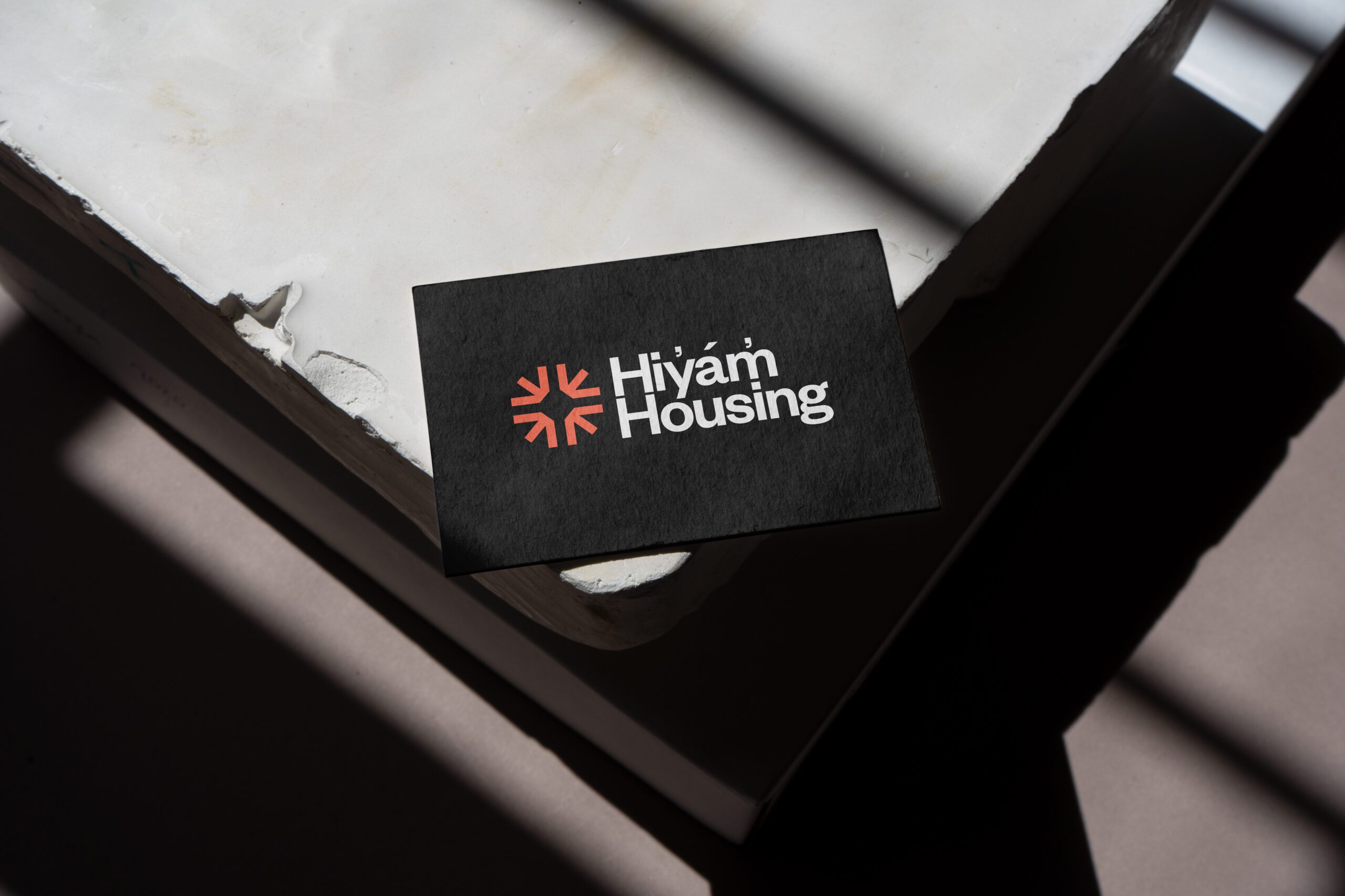
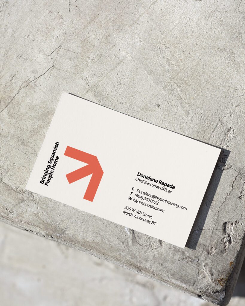
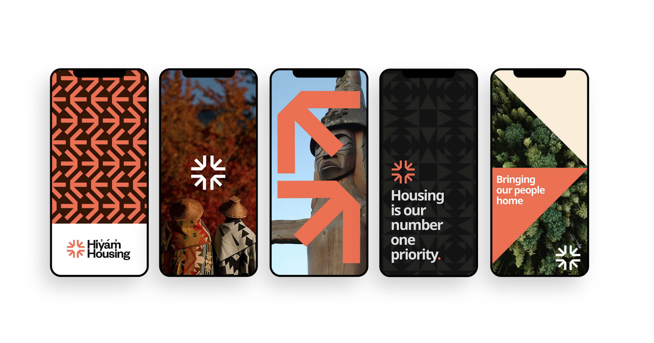
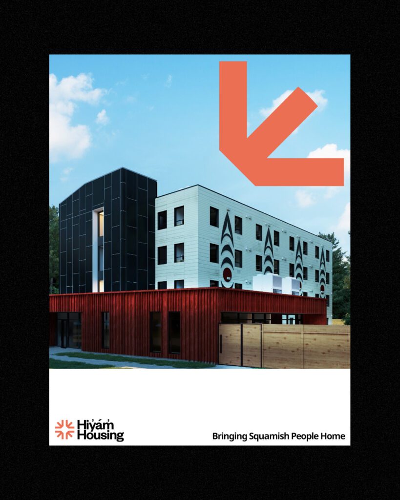
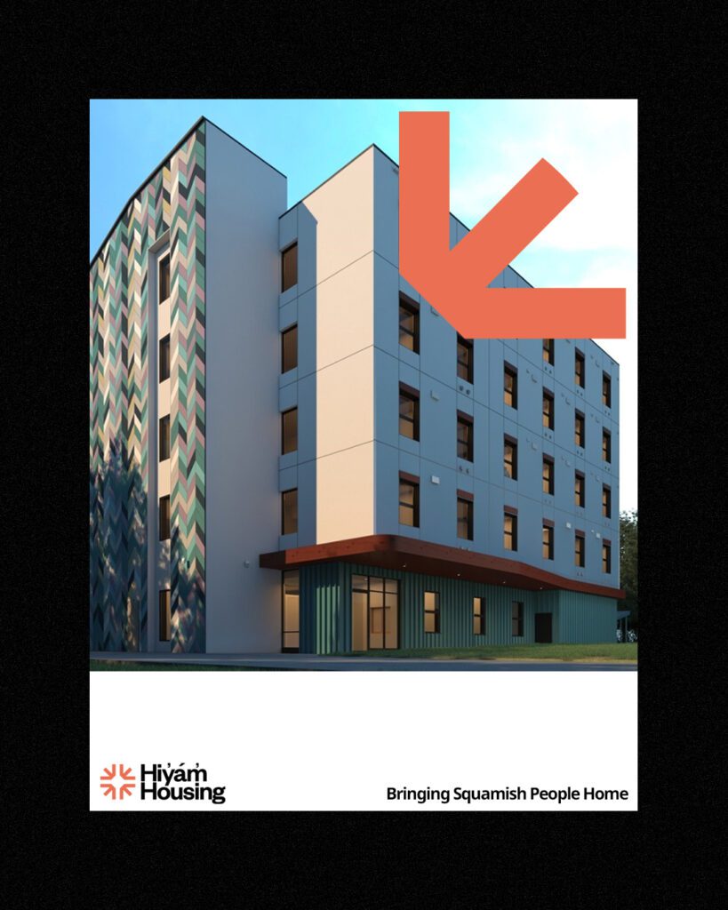
Aligned with the Squamish Nation's strategic priority, Hiy̓ám̓ Housing was established to address the housing needs of every Squamish member within a single generation or to 'Bring Squamish Home', not only physically house but create a cultural, spiritual, intellectual and emotional home aiming to achieve this goal within a 25-year timeframe.
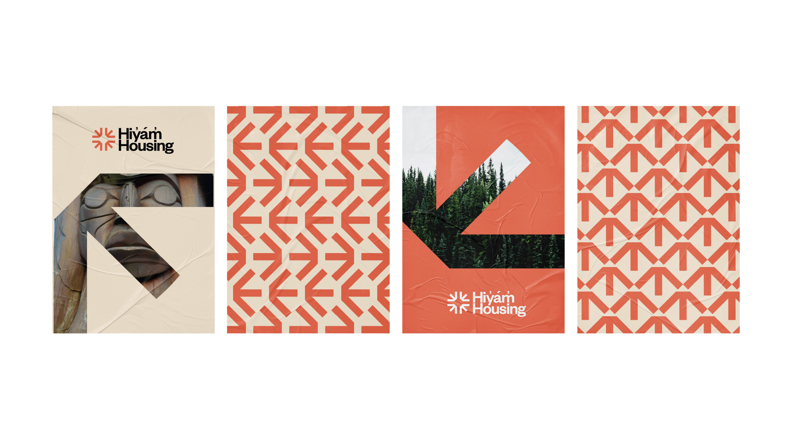
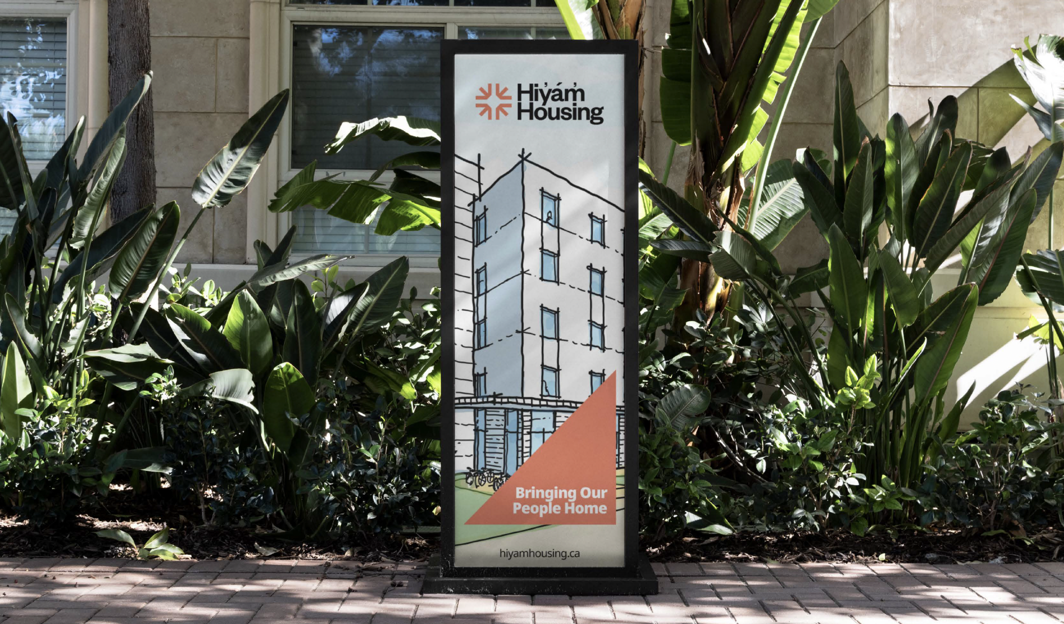
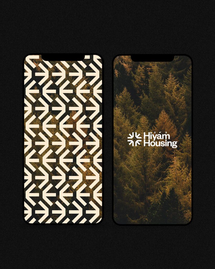
Loki Creative collaborated with Hiyam Housing in crafting a fresh brand perspective that pays homage to tradition while embracing future prospects.

Methodology

In order to grasp the aspirations of Hiy̓ám̓ Housing, we conducted a brand visioning workshop involving staff and board members. During the collaborative session, they shared their goal of having a modern brand that is reflective of their community while remaining minimal and design-forward and connecting to their community and organization's partners.
The goal was to create a minimal, polished and creative design concept that is connected and inspired by the roots of the Squamish people with the updated branding to feel really ownable and easy to use in the future.

The Story

The resulting brand identity is heavily influenced by our research into Sḵwx̱wú7mesh worldview and art. The icon is inspired by Hiy̓ám̓ Housing's work to not only physically house but create a cultural, spiritual, intellectual and emotional home. This work aligns with the Sḵwx̱wú7mesh value of four - the four stages of life of the Squamish People, the four seasons, the four wind directions. It tells the story of the four directions the Squamish people currently reside in but also the work to bring the Sḵwx̱wú7mesh home from all directions. This led us to represent the value of four symbolically with arrows 'coming home'. The arrows from the icon are also used in a repeat pattern inspired by Coast Salish design used in weaving. The result is a culturally relevant yet corporate visual style that makes sense to the community.